Visual Data Exploration: A Fertile Ground for Data Management Research
However, as datasets grow in scale—i.e., in size and in complexity, this manual generate-and-examine process of visual data exploration ends up being a bottleneck. Indeed, Tableau, which for many years operated without requiring help from data management researchers, recently acquired Hyper in an effort to help them address the scaling challenges.
There are two chief problems associated with scale; the “too many tuples” and the “too many visualizations” problems respectively.
First, when the dataset is really large, even scanning all of the relevant tuples to generate a single visualization can be very time-consuming, often beyond the realm of interactivity. (One possible rule of thumb for interactivity is 500ms —anything that goes beyond this number leads to fewer visualizations examined and fewer hypotheses explored.)
Second, even if generating a single visualization is possible within the realm of interactivity, there are often far too many visualizations to examine: visualizations can be generated by varying the visualized attributes, aesthetics, encoding, and the subset(s) of data under consideration.
Why are these two problems pertinent to data management researchers?
Consider the simplest visualization types—bar charts, line charts, scatter plots, and heat-maps—these occupy the majority of visualizations typically generated during data exploration. For these visualization types, visualizations can be abstracted as group-by aggregate queries on a collection of joined tables, with optional filters. (Note: this is a gross oversimplification, and many of my visualization colleagues would cringe at this description, but this is a SIGMOD blog, after all!) When viewed in this manner, one can abstract the “too many tuples” and “too many visualizations” problems as scalability and expressiveness questions — familiar territory for data management researchers.
Next, I will dive into the details of these problems, translate them into data management research questions, and describe preliminary work from our group and others for these research questions.
The “Too Many Tuples” Problem
When generating a single visualization on a large dataset is itself too time-consuming, what can one do?
We can leverage precomputation, but the space of visualizations that can be generated over the course of data exploration is far too large for precomputation to be applicable.
Another approach is to leverage approximation—generate the visualization such that it “looks” like the visualization computed on the entire dataset, while in fact it is computed on a sample. If the approximate visualization “looks” like the actual visualization, then users can make decisions using the approximate one without waiting for the visualization on the entire dataset to be generated. Usually, these decisions rely on the “big picture”, and inaccurate values are often not a barrier to decision-making.
This problem is similar to canonical approximate query processing (AQP), except that there are two key differences. First, the objectives are often not the same: for example, in AQP, the error on each aggregate is the chief measure of interest, while here, even if we get individual aggregates wrong, it can still lead to a useful visualization. In particular, if users are interested in the overall trend, even if individual aggregates are wrong, when compared with other aggregates, if it still leads to a similar looking visualization (in that the bars or trend is similarly shaped, or the color hue is similar), this would be adequate to draw correct conclusions. Thus, there are perceptual aspects that can inform our approximation schemes. Second, since visual data exploration is an ad-hoc process, it is impossible to expect a workload that we can use to generate precomputed samples up front, unlike traditional sampling engines like Aqua and BlinkDB.
We attack this problem from two different perspectives. These two perspectives take advantage of an online sampling engine that we developed, called NeedleTail, presented at HILDA 2018; NeedleTail uses compressed bitmaps to select tuples to read on-the-fly that satisfy arbitrary user-specified predicates appearing over the course of adhoc visual data exploration.
Accelerating Comparisons
When making decisions and drawing insights, data scientists care more about the “big picture” —the trends and comparisons— as opposed to actual values. For example, consider generating a bar chart of average delay by airline on a dataset of all flights in the last 15 years (see Figure 1 left). The fact that the average delay of UA is greater than that of SW is usually more important to a data scientist than getting the exact average delay of UA. In our VLDB 2015 paper, we considered the question of how we may use online sampling techniques to guarantee the correct pairwise ordering of bars within a bar chart; ordering the bars correctly allows users to draw correct comparisons across them.
 Figure 1: Exact Visualization (left) and Approximate Visualization (right) of Average Delay by Airline
Say we had already taken some samples leading to the bars (with confidence intervals) as shown Figure 1 right. Should we sample more from UA (which has a larger confidence interval, but this interval overlaps less with others), or from AA (which has smaller confidence interval, but this interval overlaps more with others)? Our paper answers this question by developing a sampling algorithm that is guaranteed to be optimal, in that it takes no more samples than is necessary in the worst case. Our algorithm is also several orders of magnitude faster on real-world datasets compared to other algorithms that provide comparable output guarantees.
Accelerating Termination
Data scientists often want to make decisions early, without waiting for the visualization on the entire dataset to be generated. One approach is adopt online aggregation and display the visualization as samples are drawn, as in Figure 2—as samples are drawn over time (from left to right), the trend line (top) or heatmap (bottom) varies rapidly and then eventually stabilizes. Unfortunately, at intermediate steps, it is hard to draw conclusions with confidence.
 Figure 2: Current Online Aggregation-based Approach to Approximation
In our VLDB 2017 paper, we targeted the generation of visualizations incrementally, adding in the most important features within the visualization before the less important ones, with guarantees. For example, for a trend line (Figure 3 top), our tool, IncVisage, would first approximate it with a flat line, then split that into two, and so on and so forth—at the kth iteration, we would show the user the best k-segment approximation of the trend line. Similarly, for a heatmap, IncVisage would repeatedly divide a rectangle within the heatmap into four quadrants based on which division would be most informative. For example, at time t7 in Figure 3 bottom, we can already tell that the areas with high intensity are at the top right and bottom left corners, as well as the middle areas.
 Figure 3: The IncVisage Approach to Approximation
Given the new interface, we were curious to see if users are able to interpret and make use of these approximations. Via user studies, we found that IncVisage led to double the decision-making accuracy of a standard scheme (as in Figure 2) that displays all of the features of the visualization as they are being generated. This was surprising to us, since IncVisage knowingly obscures the freshest estimates of each aggregate, in favor of returning refinements that are guaranteed to be the best possible refinement at that point. We also showed that IncVisage is able to generate visualizations that preserve all of the important features often 50X faster than simpler approaches.
Other Work and Future Directions
There has been other recent work specifically targeting the “too many tuples” problem. Procopio et al. looked at the question of accelerating joins, while Wu and Nandi articulate a similar vision towards explicitly creating and building perceptual models. The excellent paper on M4 targets the accelerated generation of time-series taking into account perceptual aspects, while the paper by Wu et al. and the one by Rong and Bailis target the smoothed generation of visualizations, preserving outliers and distributional aspects. Work from the visualization community, such as Nanocubes and Immens, has adapted data cube techniques for exploring a restricted space of visualizations. Dice addresses similar problems via distributed execution and speculation, while Forecache relies primarily on speculation. Other recent work has evaluated the benefits of progressive visualization methods like IncVisage, such as Moritz et al., and Zgraggen et al.
There are many questions that still remain unanswered in this space: can we develop a general-purpose perceptually-aware accelerated visualization generation scheme that adapts to any visualization modality: scatterplots, bar charts, trend-lines, or heatmaps, or any decision-making criteria: comparisons, patterns, trends, values? How do we model perceptual aspects quantitatively? How do we bridge offline and online sampling to support approximate visual data exploration? How do we best represent and communicate the uncertainty that arises as part of online sampling for visualization generation? How does one automatically select the right binning for a visualization? How does one eliminate noise from a visualization while keeping the outliers? To date, it is not clear which perceptual aspects are most crucial from an end-user’s standpoint.
The “Too Many Visualizations” Problem
How does one find visualizations that that display specific visual trends in a large collection of visualizations?
Say we were looking at a sales dataset, and wanted to find a product whose sales has dipped over the past three months. How would we do this? As of now, using a visualization tool, our only strategy is to generate and examine the sales trends of thousands of products manually until we find one that matches the desired dip.
Another approach is programmatically loop over the product charts and automatically evaluate this predicate, but this is not straightforward either—first of all, we would need to write code for every single new need: for example, if instead of the aforementioned need, we wanted to find a product whose sales is similar to that of “chairs”, or a product whose profit trend is atypical, this would require a substantial modification of the existing code. Or you might want to search over the space of possible attributes; for example, you may want to find an attribute that is correlated with sales for the product “chairs”, or a pair of attributes that distinguish the products “chairs” and “tables”.
Overall, what we need is a system that allows data scientists to search for visualizations that satisfy certain patterns or trends. This involves challenges in the query specification layer—how these queries can be expressed, the interpretation layer—how to interpret fuzzy predicates, like “similar” or “typical”, and the execution layer—how to traverse through large collections of visualizations to find those that match the desired criteria.
Accelerating Search
The first step that we took towards addressing the “too many visualizations” problem was to design a tool that can accelerate the search for desired visual patterns.
Our tool, Zenvisage, provides users a canvas where they can sketch or drag-and-drop a desired pattern, with the ability to tailor the matching criteria or space of visualizations. In Figure 4, we show Zenvisage being used to traverse the space of sold price per sqft trends over months for various cities in the United States. The visual “canvas” is shown in the center top panel. You can sketch a pattern in the canvas, like the linearly increasing one displayed below, or drag and drop any visualization into the canvas. Matches are displayed below the canvas, starting with a city called “The Village”. Representative patterns, such as Greater Carrollwood, and outliers, such as Temperance, are displayed in the right hand side panels to contextualize the search. The system also provides a number of knobs to fine-tune the search, including changing the similarity criteria, smoothing, or filtering. In our recent VLDB 2018 paper, we developed lightweight approximation schemes to make this search efficient for arbitrary collections of visualizations.
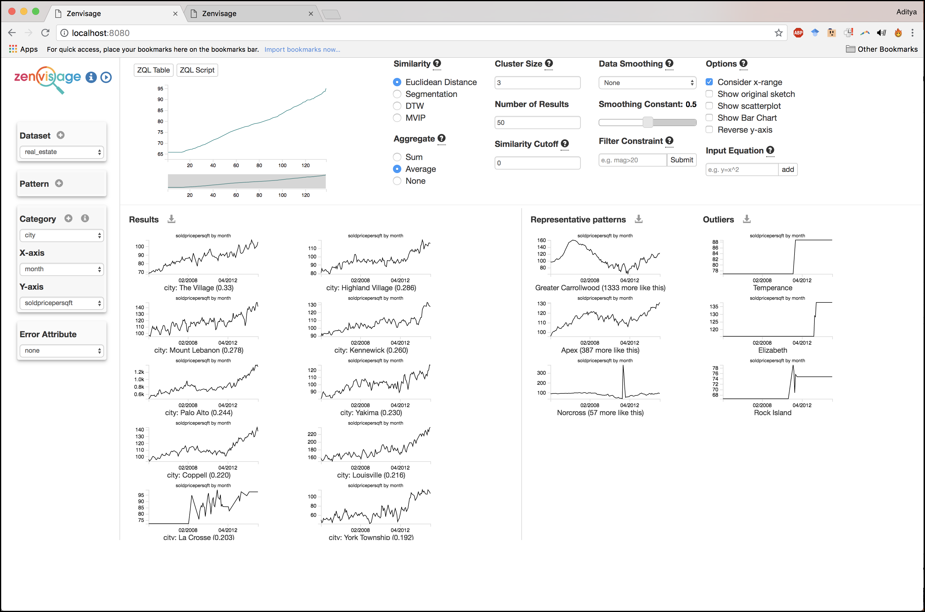 Figure 4 (click the image to zoom in): The basic Zenvisage Interface. Attribute selection on the left, representative patterns and outliers on the right, with a canvas in the center top, where a user has drawn an increasing trend, with results displayed below.
For more advanced needs, Zenvisage provides a query language, called ZQL (Zenvisage Query Language), described in our VLDB 2017 paper, that allows users to execute multi-step exploration workflows. Figure 5 top and bottom display the US states where the sold price per year trend is most similar to and most different from the sold price per square foot trend respectively: NV, AZ, and RI (LA, NE, KY) are the ones where these visualizations are similar (different). ZQL can also be used to summarize, correlate, drill-down, pivot, and filter collections of visualizations. The design of ZQL draws inspiration from Query by Example and visualization specification languages like VizQL.

 Figure 5 (click images to zoom in): The advanced Zenvisage Interface, with ZQL: the states where the soldprice by year and soldprice per square foot by year are most similar (top), and most different (bottom).
Another challenge with ZQL is how we can execute ZQL queries in an efficient manner, given the number of visualizations that need to be examined. We’ve developed an optimizer, titled SmartFuse, that combines parallelism, batching, and approximation to return results efficiently.
Zenvisage has been used by domain experts in astrophysics, genomics, and battery science—a number of features that we have added have been inspired by these target applications, over the course of a year-long participatory design process (see Figure 6 displaying our timeline and the features developed). One lesson that we took from this experience is that visualization needs are extremely domain-specific, requiring customization and fine-tuning for any new application. Our experience was crucial in identifying requirements for Zenvisage and ZQL.
 Figure 6 (click the image to zoom in): Features developed for our domain experts
Accelerating Discovery
Another way to tame the “too many visualizations” problem is to have the system provide automatic recommendations of visualizations. These could be visualizations that provide additional context, highlight interesting or unusual trends that are related, or cover attributes or data subsets that are underexplored.
In our basic Zenvisage interface, we provide simple recommendations of typical trends and outliers for the collection of visualizations currently being explored (as described in our CIDR 2017 paper)—these are the right hand side panels of Figures 4 and 5.
Another approach is for users to provide cues for which data subsets they would like to see visualization recommendations for. In our SeeDB system (described in papers in VLDB 2014 and VLDB 2016) data scientists indicate a subset of data they are interested in, with the system providing visualization recommendations that highlight differences between that subset and the rest of the data. We found that SeeDB encouraged users to explore twice as many visualizations, and bookmark three times as many visualizations when compared to a tool that doesn’t make recommendations based on data differences.
Other Work and Future Directions
There is a variety of other work on trying to allow users to search for visual patterns or trends. Work from the data mining community has targeted the efficient search of a fixed set of time series patterns (as opposed to visualization collections constructed on the fly); work on TimeSearcher and Query by Sketch developed interfaces for visual search of time-series patterns. There has been other recent work on visualization recommendation, including Voyager, Datatone, Eviza, Vizdom, Profiler, and Data Polygamy. One issue with visualization recommendation in general is that it can encourage confirmation bias and lead to false discoveries; recent work has outlined several methods inspired from statistics to address this issue.
Despite all this work, the “too many visualizations” problem is still wide open. In a sense, the “too many visualizations” problem is the holy grail of data exploration: how do we find the hidden insights (needles) in a large dataset (haystack)?
This manifests itself in many smaller questions: How do we support visualization recommendations when users do not know what they are looking for? How do we provide them a high-level summary of the dataset—of the attributes and trends? How can we provide recommendations that go beyond surface-level data difference and take into account semantics or user goals? At the same time, how can we build in the safeguards so that we do not fall into the statistical pitfalls that underlie p-hacking? More specifically, for systems like Zenvisage, can we come up with intuitive ways to express complex ZQL queries? How do we support data exploration tasks that go beyond pattern search and retrieval? How do we support immediate feedback and refinement? Moreover, is ZQL really the right layer of abstraction for novice data scientists, or should we be translating down from a different abstraction? What are the right metrics, and how do we evaluate the performance of visualization search and recommendation systems?
Conclusions
Visual data exploration is an important part of information visualization, and is a rich source for a number of important and challenging problems from a data management perspective—that reveal themselves as soon as we view a visualization as a humble SQL query.
While I focused on our work on accelerating comparisons and termination for the “too many tuples” problem, and accelerating search and discovery for the “too many visualizations” problem, there are still a number of interesting open data management questions for both of these problem domains.
At the same time, we must also acknowledge that these questions do go beyond data management: we need to understand how data scientists perceive visualizations and interact with them. Moreover, we also need to understand the ways visualizations are used, the typical exploration patterns, and the end-goals. Not only will this inform our research questions and metrics, it will also help us ensure that what we’re doing meets real-world needs and use-cases.
It is therefore also paramount that we work together with visualization researchers for formalizing these research questions, and for conducting user studies to ensure that our techniques are useful and usable in practice.
Overall, the data management community has the potential to take on a leading role in building scalable, usable, and powerful tools for data exploration—of which visualization is an integral part. I hope you’ll join us in this exciting journey!
Acknowledgments: A huge shout out to my students and collaborators in making these ideas come to life. In particular, the PhD students involved in the work mentioned in this blog post include Silu Huang, Albert Kim, Doris Lee, Stephen Macke, Sajjadur Rahman, Tarique Siddiqui, and Manasi Vartak. Our work has been done in collaboration with Profs. Karrie Karahalios, Sam Madden, and Ronitt Rubinfeld. Thank you to Eugene Wu for his constructive and detailed feedback on this blog post.
Blogger Profile
Aditya Parameswaran is an Assistant Professor in Computer Science at the University of Illinois (UIUC), where he has been since August 2014. He completed a yearlong postdoc at MIT CSAIL, following a PhD at Stanford. He develops systems and algorithms for “human-in-the-loop” data analytics. His website is at http://data-people.cs.illinois.edu, and his twitter handle is adityagp.
Copyright @ 2018, Aditya Parameswaran, All rights reserved.